Full Text:
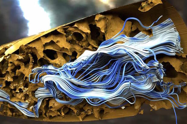
When scientists run experiments--whether physically smashing atoms at the Large Hadron Collider or virtually simulating future weather--the output is often a huge set of numbers incomprehensible to the ordinary human brain. To tame the data and put it into a form that our minds can understand, researchers use scientific visualization.
In its simplest form, scientific visualization can be a graph or chart. But in cases where researchers need detailed information to draw insights--say to understand how a protein functions in cancer and to design a drug to combat it--scientific visualization can be quite complex.Image credit: Data courtesy of Michael Sukop, Sade Garcia, Florida International University and Kevin Cunningham, United States Geological Survey. Visualization: Carson Brownlee, Aaron Knoll and Paul Navratil, Texas Advanced Computing Center
